 One of the most important results I want for my clients is to be truly self expressed through their branding and marketing, as well as to attract perfect customers who really ‘GET’ them. That goes for my more “airy fairy” customers as well as my more traditionally focused peeps. Because my personal style is both airy-fairy and basic/traditional, I enjoy creating designs on both sides of the style fence. This page is dedicated to the more traditional style business brands I’ve created over the years. Below I have outlined 2 case studies followed by a variety of branding and website designs that required a more traditional touch.
Perhaps this style is more along the lines of what you are seeking that other design styles in my portfolio.
Enjoy!
Love,
Julia Stege
The Magical Marketer
Cabiles, McKusker & Lynch Utility Design
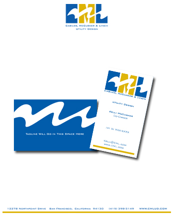
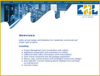
When Kelly McKusker came to me needing a brand for her energy consultantcy and utility design business, we discussed the differences between her personality and the personality of her clientele. As an energy consultant, she deals with folks at the energy company and construction companies, both very male-dominated businesses. She wanted a classic corporate appeal with a bit of a feminine twist. We decided to use an ‘Energy Wave” that goes across the blocky “CML” initials for the logo. We then used the “Energy Wave” as a key element on the site. The resulting brand has the feminine feel while still being professional and appealing to her clientele. Below you will see the logo design, the business cards and stationery, and the website design. Visit the live website at http://www.cmlud.com
Project Solutions Network, Inc.
When Beth Blevins came to me for a website to promote her technical writing and documentation business, we connected right away on the basis of our shared passion for the divine feminine. In fact, she told me her goal in working with corporations was to bring the divine feminine into the corporate setting so it can be transformed. I loved that goal, and to achieve it we knew we couldn’t have pictures of Beth in flowing goddess outfits or lots of purple lotuses in the design. It would have to be pretty corporate. So how to do that without the result being boring?
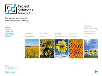
Beth organizes complicated content for corporations, so we wanted the site to be organized to demonstrate the clarifying process Beth uses. Additionally she already had a logo that we wanted to integrate into the design. I actually ‘downloaded’ an image after we spoke and I told Beth about it. “What do you feel about sunflowers? I’m getting that we need to use sunflowers to show your process.” And that’s exactly what we did. Using the sunflower, we showed the various stages of Beth’s process so you don’t even have to leave the home page to know what she does. Plus the use of the sunflower brings in the divine feminine without it being TOO feminine or too spiritual. When you look at the site, you see on the home page we have an interactive graphic that depicts the steps Beth goes through to create her ‘project solutions.’ See the live site at http://www.psndoc.com/
More Executive, Corporate,
and Traditional Style Branding and Website Designs
Earth Calm
Logo Design
3-Fold Brochure Front
3-Fold Brochure Back
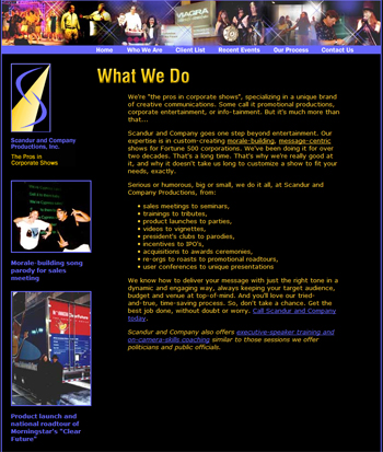
Scandur and Company Productions, Inc.
The Pros in Corporate Shows
Logo Design
Website Design
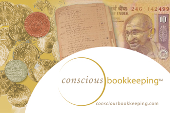
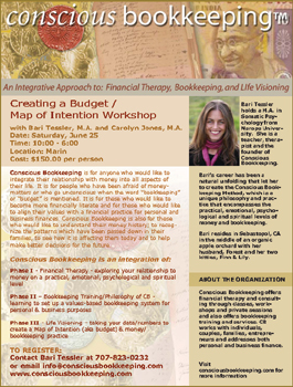
Conscious Bookkeeping
Postcard Design
Flier Design
RG & Associates
Logo Design
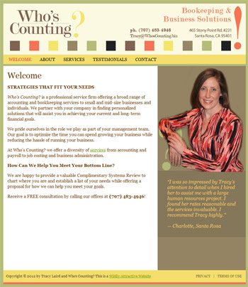
Who’s Counting? Bookkeeping Services
Logo Design
WordPress Website Design

